PETAL BY PETAL, THE FLOURISHING OF A FLOWER. INTERVIEW WITH ANNA ROLSKAYA
At first, chaos on the canvas is a necessity.
Colour is applied to it with a quick and intuitive gesture that, by now, knows where to build it up to create weight, and where instead to lay it in loose fields of colour to open the work to lightness. There isn’t any direction already set up, but only the urgency to manifest an impulse that still has no form.
Then the artist rotates the canvas, thereby changing its original perception, with the aim of forcing the gaze to abandon its previous points of reference, and seek a new path toward a surface that is layered and hierarchically composed.
It is now possible to start painting and to give free rein to creativity.
This is the creative process of contemporary abstract painter Anna Rolskaya. It is a search for completeness that lingers in uncertainty for as long as possible, until something true emerges.
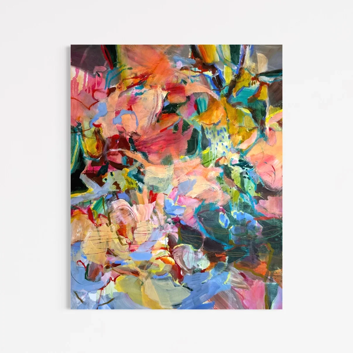
Structure of Care, Anna Rolskaya, 2026.
What is the first creative moment that you remember? Did it overlap with your choice of being an artist? Do you remember what emotions led your hands in that very moment?
My first creative moments were not about art at all. They were about finding creative solutions to everyday obstacles. The choice to become an artist came later, in primary school, and yes, in some way it grew out of the same instinct. I was the shortest in my class and failing in most subjects, and art became my superpower. It was a shortcut to some kind of fame, a chance to be someone, to stand out, and to respect myself. I was fighting for attention, for recognition, for validation. What led my hands was determination. I wanted to master skills I could be proud of, skills my teachers would applaud. I didn't take drawing and painting seriously until I entered art school at the age of nine.
Is "the feeling of being fully known, and thus, of not being alone" the purpose of your work? And in what way has this need of yours flowed into your choice of abstraction as a pictorial language?
I guess so. If we are talking about that particular loneliness you feel with yourself, when you are not enough for you, and something, or someone, is still missing. Then my practice is a way of opening a dialogue with myself, like a diary. Just as some thoughts only become clear once you write them down on paper, the canvas gives me a space where I can talk to all the facets of my personality and feel heard and understood.
As for abstraction: at art school I was taught to draw and paint from still life, where you have to stay close to what you see, where the work must be recognisable. I found it tiring to focus so much on what is in front of you, outside of you. Abstraction lets me do the opposite. I can get lost, get carried away, disappear into a trance-like state, follow curiosity, and explore the unknown.
This escape from depiction, from the obligation to faithfully represent reality, is an opportunity for the artist to create parallel worlds — as outlined in her artist statement — here the spectator is invited to get lost.
“Colour is not chosen intellectually, but recognized, the way you recognize your reflection. Each painting becomes a mirror of a particular inner state.”
You say you don't work in series, and that each of your paintings is a singular curiosity carried through to its conclusion. Even so, is it possible to find a common thread in the colours you use? What meaning lies behind their choice? What emotions do they symbolize?
Yes! I love the power of pink, or pinkish colours. Pink lands somewhere deep inside me, around my chest. I feel touched, connected; we are in a dialogue. I can't take my eyes off it, as it were magnetic. But pink doesn't work alone. It needs a supportive colour, a muted green, blue, or purple.
My other palette comes from references to classical art. It is less electric, more conventional, more mature: yellow, orange, deep blue, green. I am still getting used to these colours. I've surrounded myself with them at home to explore how I feel about them. I used to rely on the colour wheel to find how colours work together. Now I rely only on my inner sensation.
Let’s talk about Unfolding, Still (100 x 100 cm).
The artwork, which appeared in the online exhibition Color as Concept, was created using layered acrid and oil paint on canvas. It presents a widespread composition of colour. Of course we can see this sweet, pinkish peach, and then — as you said before — this supportive palette of burned orange, olive green, mint, pale blue, ochre and deep charcoal.
Large painted forms, drawn lines and fragmented botanical figures move across the surface. Glimmers of light break up dense areas of colors, balancing their heaviness.
The title combines two states: the gradual transformation and the apparent stillness, suggesting the idea of an inexorable change, even though things always remain the same.
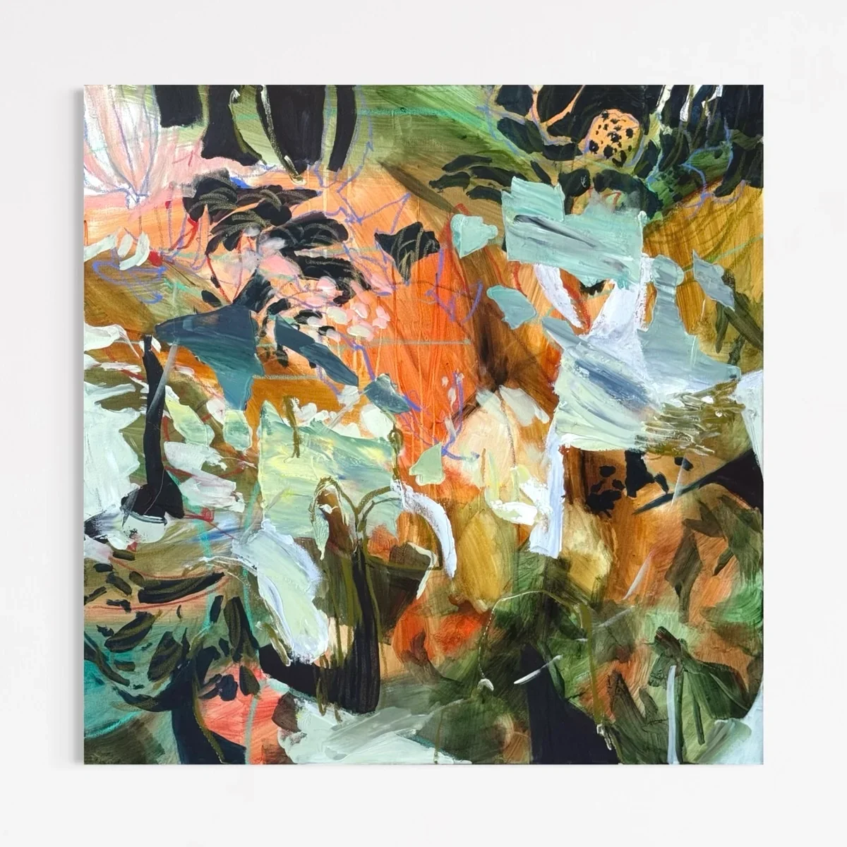
Untitled, Still, Anna Rolskaya, 2026.
As you said once: "Colour is not chosen intellectually, but recognized, the way you recognize your reflection. Each painting becomes a mirror of a particular inner state.” So, could you tell us who is the Anna you recognize standing in front of the painting? Who is Anna who decided to dress herself in this work?
It's Anna who finally has the mental capacity to put her pink aside for a while and open her heart to a new experience. She starts a new dialogue and a new exchange through colour, connects with a different audience, taps into collective memory. And, as it turned out, to make something my dad would truly love, because it reminds him of a stamp he collected as a boy.
Lisbon is a land of disenchantment and love, as you probably know, witnessed in the 20th century by the masters of Portuguese poetry, such as Fernando Pessoa, Luís de Camões, and Florbela Espanca. How does this place relate to your art? How is it shaped by it?
For me Lisbon is a place of peace. I even live in Rua da Paz. Here I found peace with myself, with my art, and with the world. Lisbon has so much light. Our two balconies let it all in, along with a beautiful view of the city, the Palácio de São Bento and the Basílica da Estrela. This light helps me see colours clearly, with more nuance. I can see them all together, dissolve in them, and simply follow and flow. Interestingly, when I first moved to Portugal to do my Master's in Porto, I expressed myself mostly through chalk lettering and calligraphy, black and white only. It was only after moving to Lisbon, six years ago, that I turned to colour and to canvas.
Looking back at your previous work, what direction do you feel your artistic self has taken? And where is it heading?
I would say I am moving towards honesty and simplicity. I love complex, layered work, but opaque layers kill something important in that first wash. I was trained in watercolour, and I love the translucent passage of colour. It gives that feeling of vitrail, of stained glass, when the light comes through, that fascinates me, and reconnects me to my childhood. My art practice is my diary, and I want to go deeper and deeper into thought, sensation, and memory.
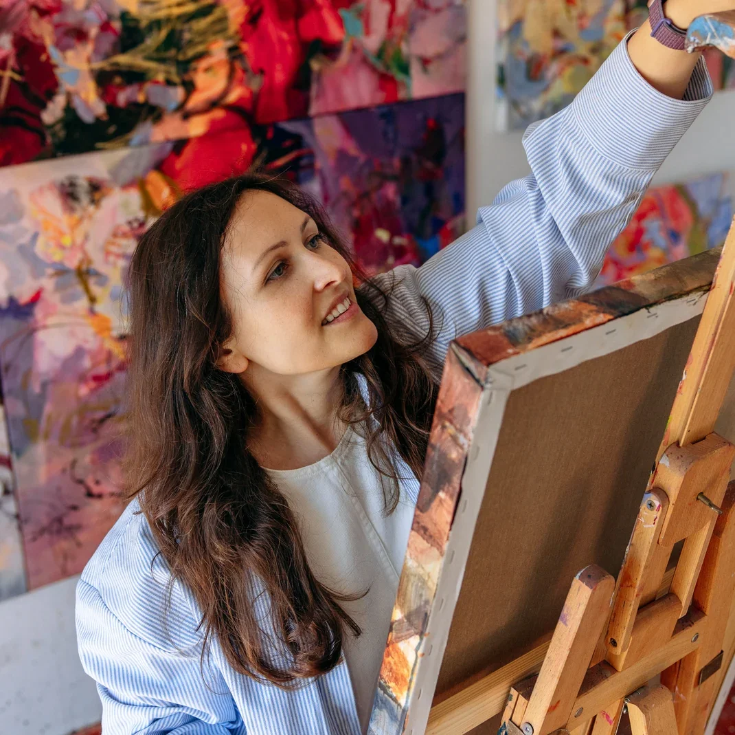
Anna Rolskaya, courtesy of Anna Rolskaya.
See more of Anna Rolskaya’s work on the artist’s website.
Article by Nicolas Sartorel
Nicolas Sartorel is an Italian writer and aspiring editor. His work bridges analytical rigor and aesthetic sensitivity, with a specific focus on the structural and formal mechanisms of literacy. Currently based in Brussels, seeking opportunities in international and multicultural environments.