Color As Concept
How do we articulate emotion or memory through hue alone and what does this distilled visual language reveal about the act of making?
This online exhibition explores the conceptual and emotional power of color within contemporary abstract practice. Moving beyond representation, the exhibition considers hue, tone, contrast and light as a language in themselves - capable of communicating sensation, memory, atmosphere and meaning without reliance on figuration or narrative. Here, color becomes more than a visual element; it operates as structure, emotion, perception and inquiry simultaneously.
The works presented investigate how artists use chromatic relationships to construct experience and evoke psychological resonance. Some approach color through formal experimentation with surface, balance, rhythm and materiality, while others engage it as a vessel for symbolism, introspection and conceptual reflection. Across these varied approaches, the exhibition reveals color as an autonomous force - one that can intensify emotion, shape spatial awareness and communicate what often resists language.
Following an international open call, Ambrose Creatives and The Ambrosia Journal received submissions from artists across more than 25 countries, representing a wide range of perspectives, practices and interpretations of abstraction. From these submissions, a carefully curated selection of works has been brought together for this exhibition, highlighting the diversity and depth of contemporary abstract expression today.
Through painting, mixed media, digital processes and experimental forms, the featured artists demonstrate the enduring capacity of color to function as both concept and experience. Together, these works invite viewers into spaces of contemplation, intensity, ambiguity and connection - offering a collective exploration of how abstraction continues to expand the possibilities of visual language.

Curatorial Statement
When reviewing submissions for COLOR AS CONCEPT, one aspect became immediately apparent: despite sharing a common point of departure, no two artists approached color in quite the same way. What emerged from the international open call was not a singular interpretation of abstraction, but a rich constellation of practices in which color functions as both subject and method. Across more than 25 countries, artists revealed deeply personal relationships with hue - relationships shaped by perception, memory, process, intuition and inquiry.
Rather than serving as a supporting element within composition, color emerges in these works as a site of exploration in its own right. Throughout the exhibition, hue becomes a vehicle for sensation, atmosphere, memory and reflection, often carrying the conceptual and emotional weight of the work itself. While each artist's practice remains distinctly individual, subtle affinities began to surface across the submissions, revealing diverse yet interconnected ways of thinking through color. The curatorial process sought to bring these perspectives into dialogue, creating a framework through which visitors can encounter color not merely as a visual phenomenon, but as a mode of experience.
To navigate this breadth of perspectives, the exhibition is organized into six thematic lenses: Color as Light, Color as Monochrome, Color as Study, Color as Relation, Color as Circularity, and Color as Flow. Together, these groupings offer different points of entry into the exhibition, inviting viewers to consider how color can be perceived, constructed, felt and understood.
Presented as individual sections within the online exhibition, each lens foregrounds a distinct sensibility while remaining in conversation with the others. Collectively, they reveal the expansive possibilities of contemporary abstract practice and demonstrate that color is never merely visual - it is emotional, conceptual, sensory and relational.
As you move through the exhibition, we invite you to slow down and engage with color on its own terms. Allow these works to evoke memories, sensations and associations that may resist articulation. In doing so, the exhibition becomes not only an exploration of the artists' relationships with color, but also an invitation to reflect upon your own.
WALL 1
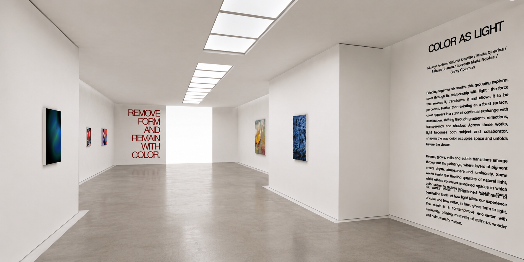
Color As Light
Masaya Goino / Gabriel Castillo / Marta Djourina / Sahaya Sharma / Lucrezia Maria Nebbia / Carey Coleman
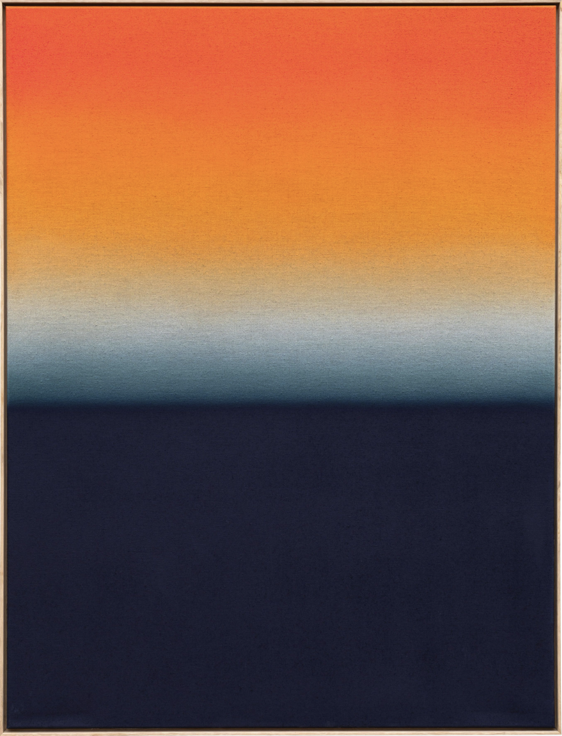
Bringing together six works, this grouping explores color through its relationship with light - the force that reveals it, transforms it and allows it to be perceived. Rather than existing as a fixed surface, color appears in a state of continual exchange with illumination, shifting through gradients, reflections, transparency and shadow. Across these works, light becomes both subject and collaborator, shaping the way color occupies space and unfolds before the viewer.
Beams, glows, veils and subtle transitions emerge throughout the paintings, where layers of pigment create depth, atmosphere and luminosity. Some works evoke the fleeting qualities of natural light, while others construct imagined spaces in which color seems to radiate from within. Together, these six works invite a heightened awareness of perception itself - of how light alters our experience of color and how color, in turn, gives form to light. The result is a contemplative encounter with luminosity, offering moments of stillness, wonder and quiet transformation.
-
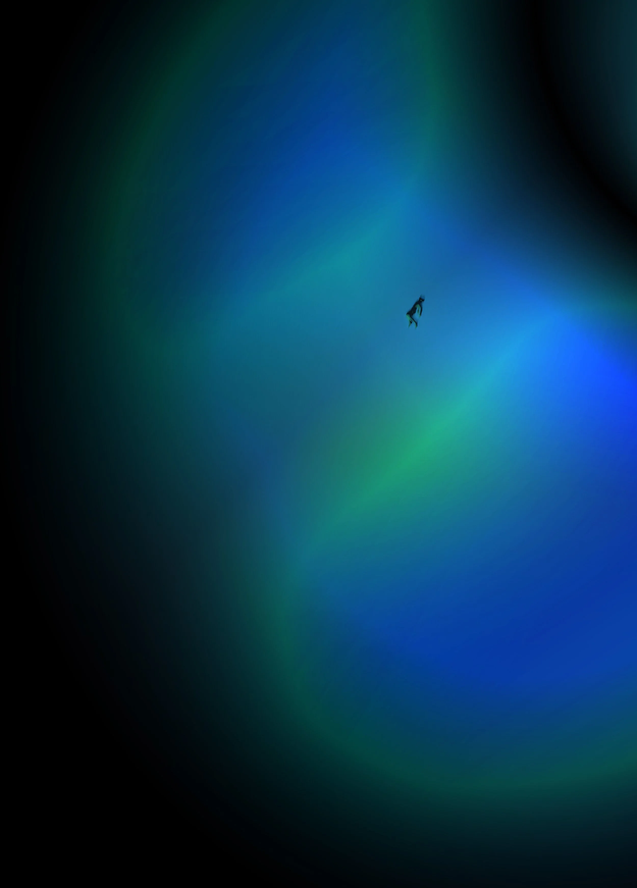
![]()
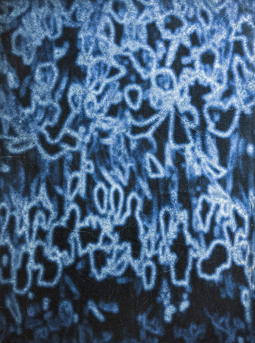
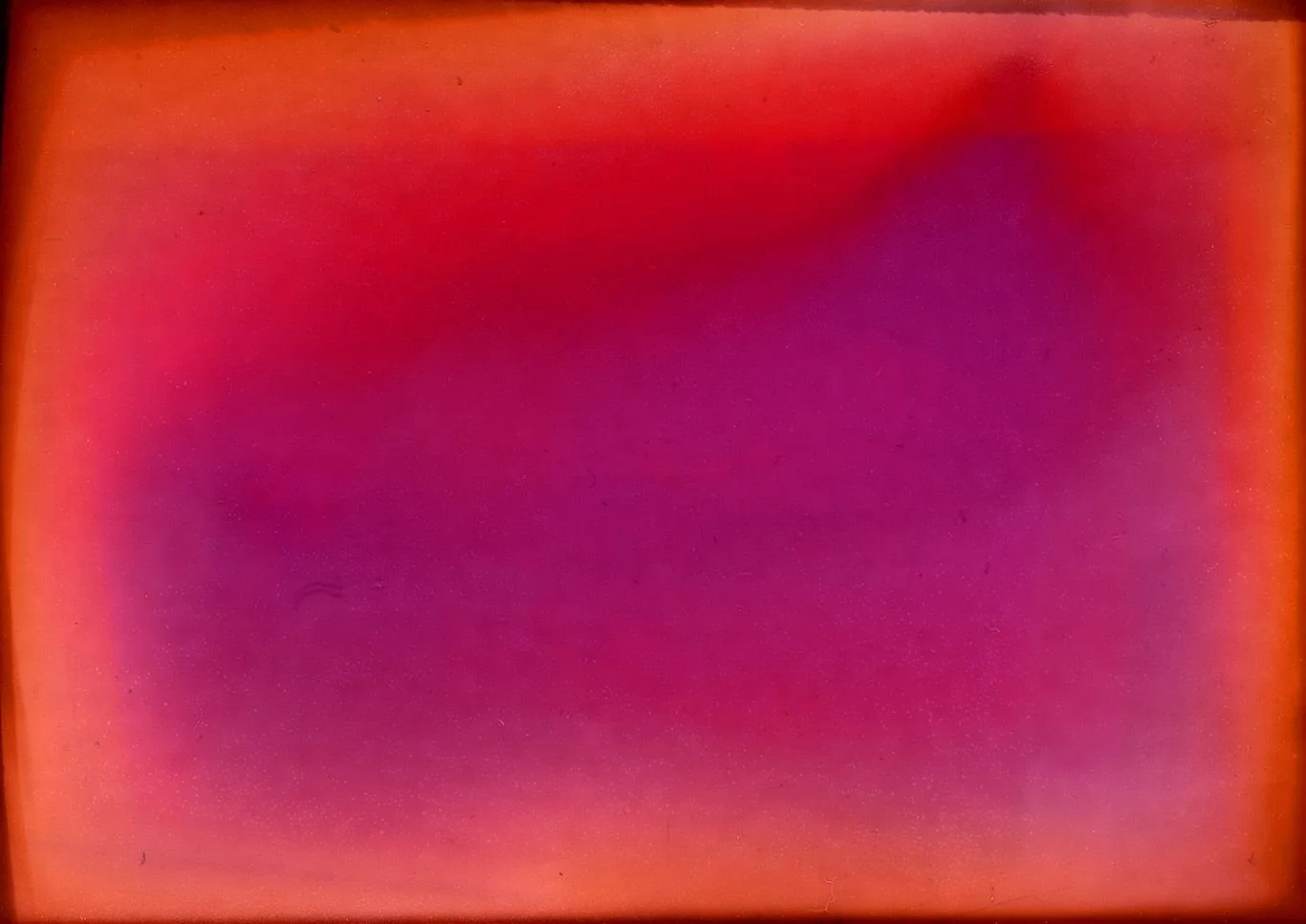
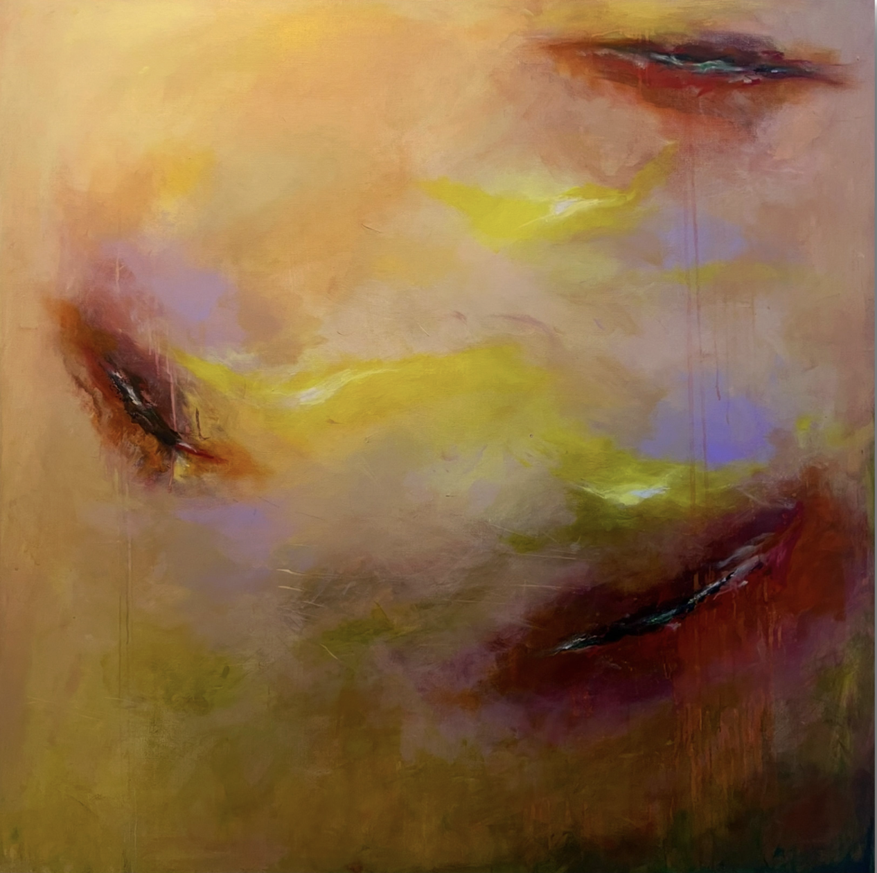
MASAYA GOINO, Polymer – Residual Blue, 2026
Photography, pigment, water and mixed media on panel 100 x 73 x 3 cm
-
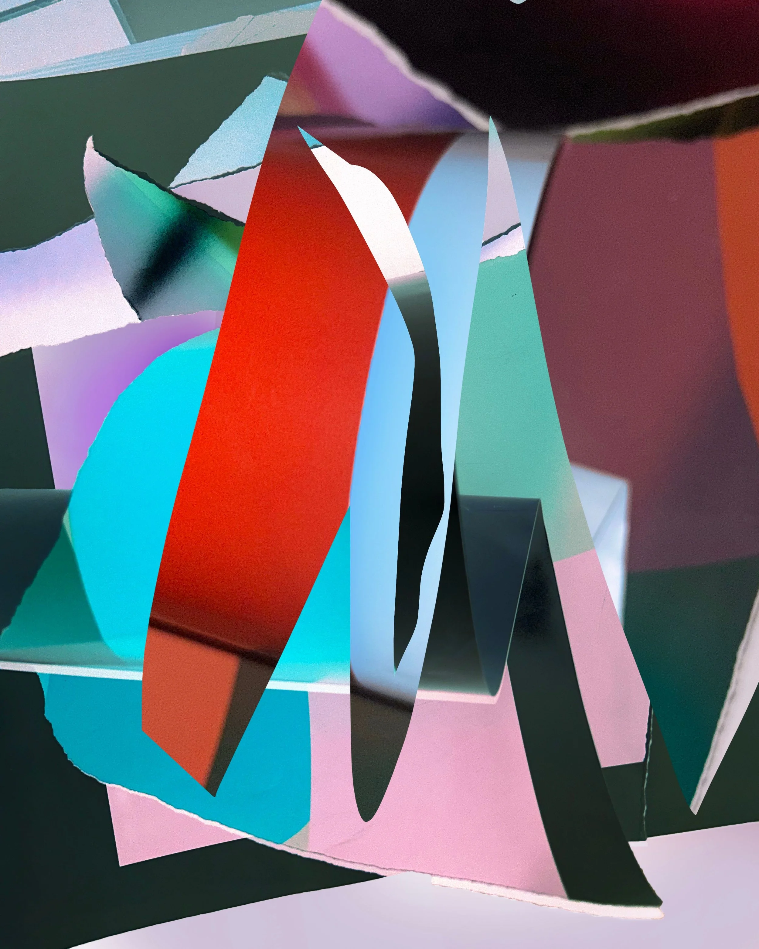
![]()
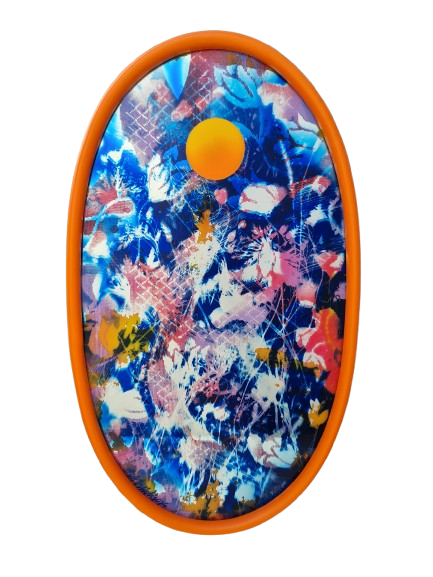
GABRIEL CASTILLO, Genesis, 2021
Digital Art; 50.8 x 76 cm
-
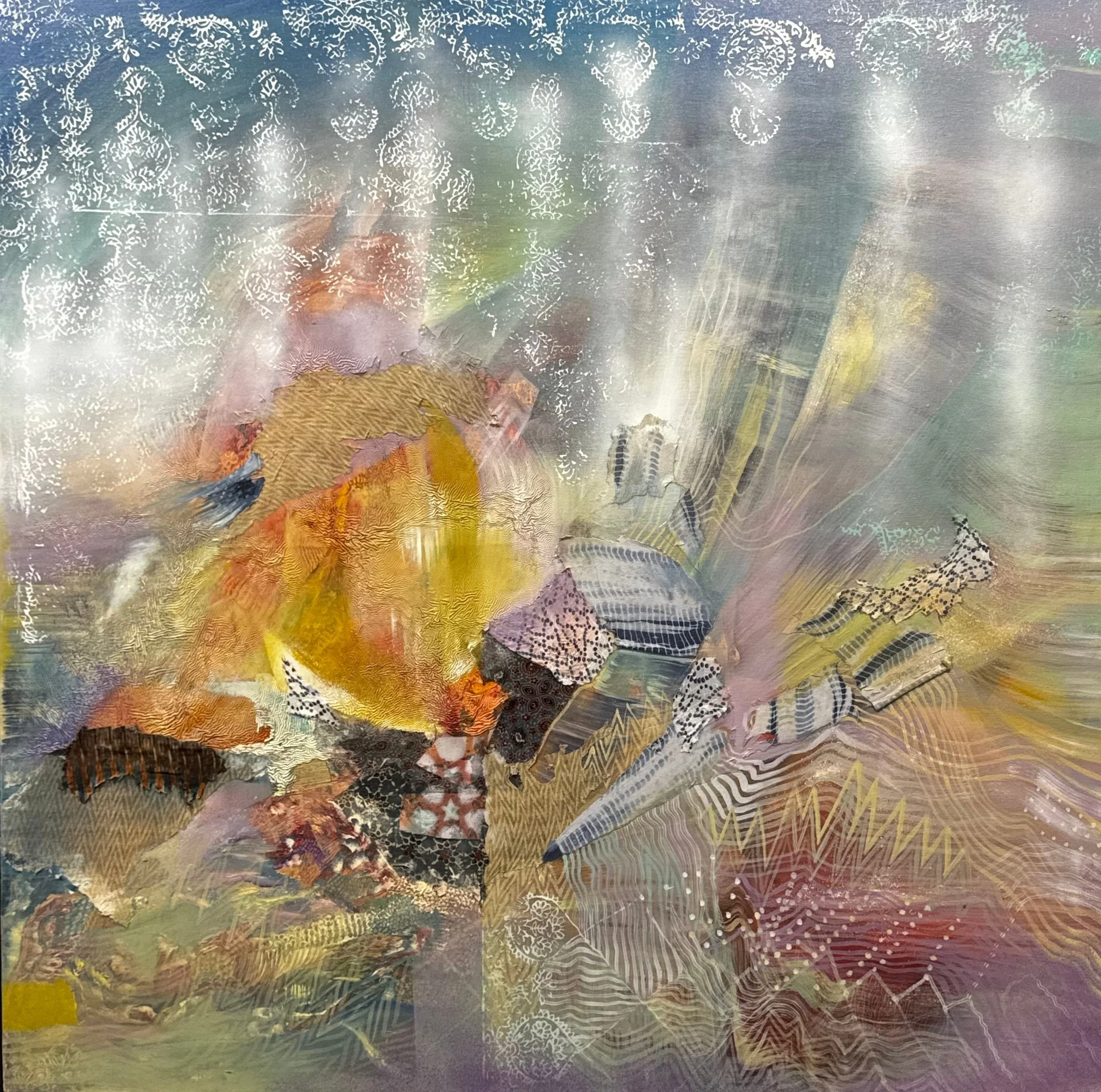
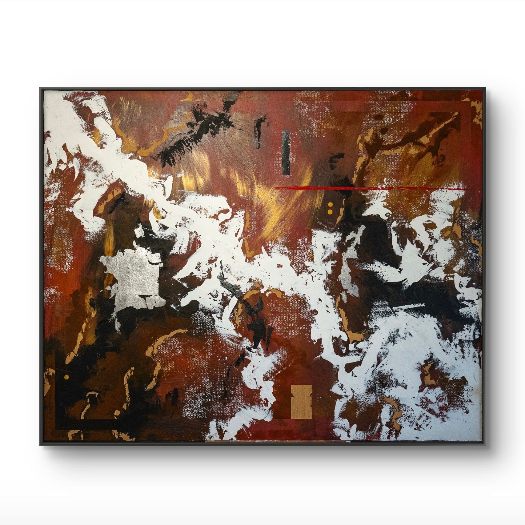
![]()
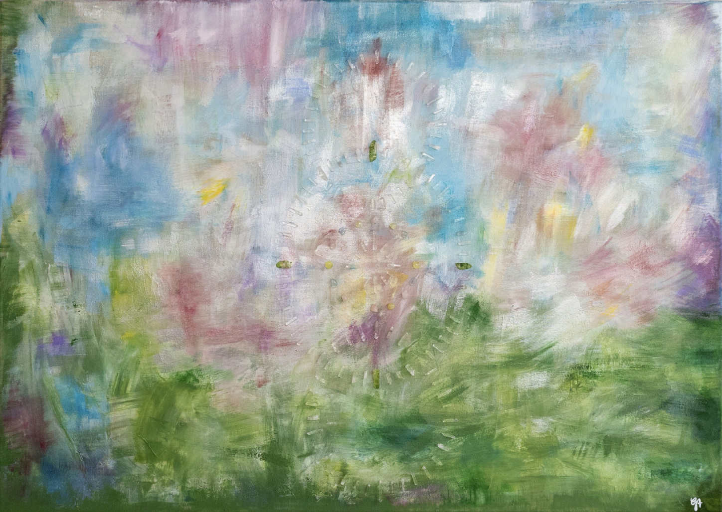
SAHAYA SHARMA, IMPRINT OF NEW MEMORY, 2019 - 2026
Oil, enamel, acrylic, spray paint, block print and up cycled textile on canvas 152.4 x 152.4 cm
-
![]()
LUCREZIA MARIA NEBBIA, Phosphenes, 2026
Photography; 70 x 100 cm
-
![]()
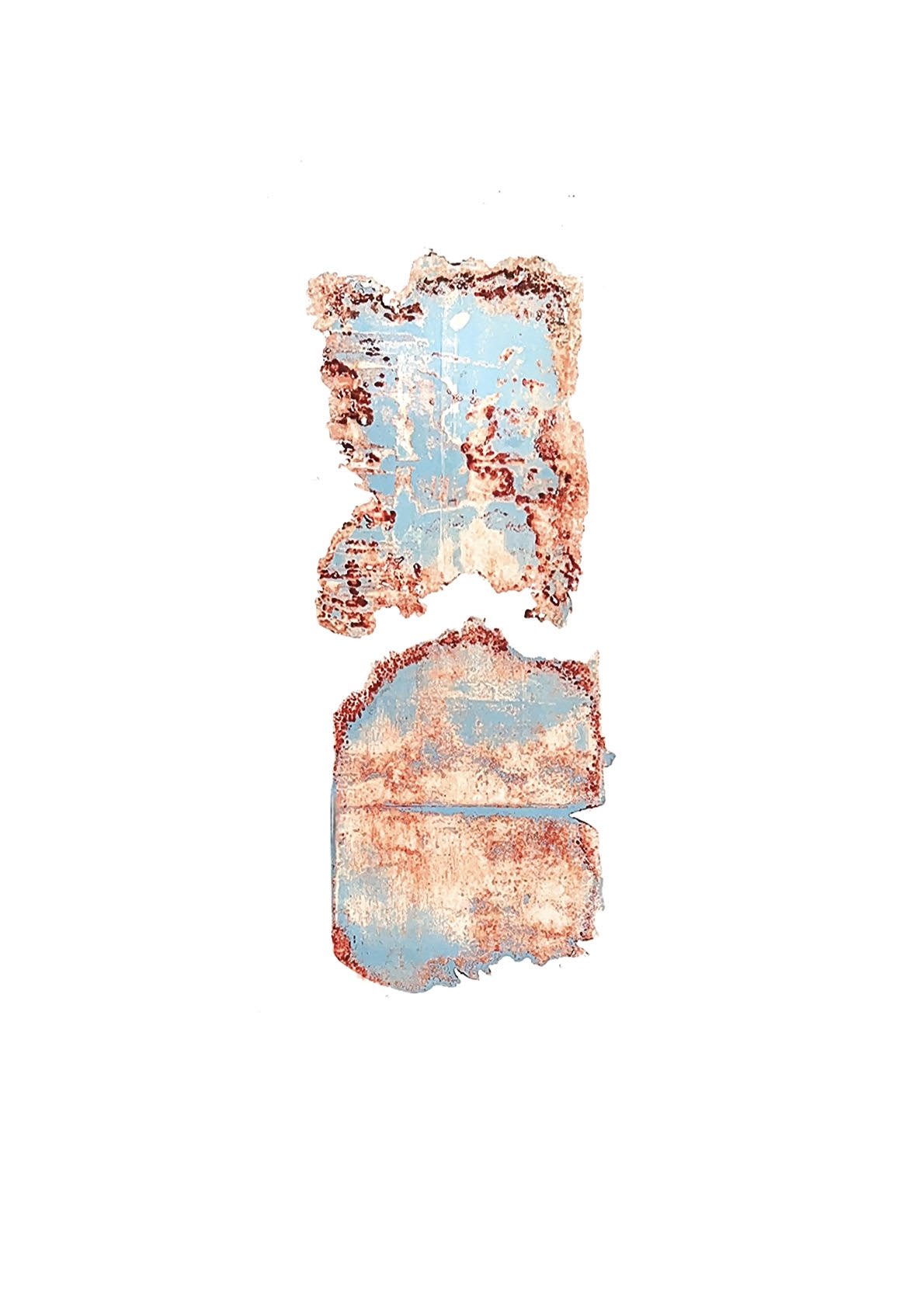
MARTA DJOURINA, Untitled , 2021
Direct exposure on folded analog photo paper with different light sources, unique 40 x 62 cm
-
![]()
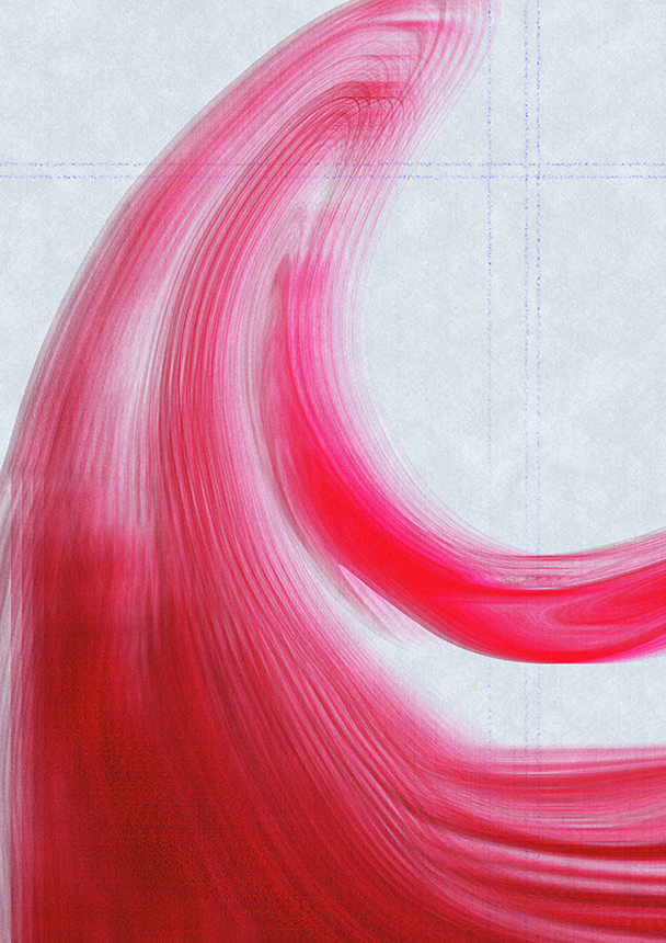
CAREY COLEMAN, Both And (Icy Hot), 2026
Archival Inkjet Print; 50.8 x 63.5 cm


WALL 2
Color As Monochrome
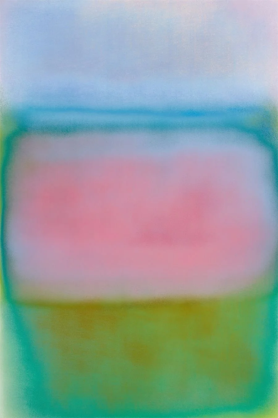
Stephanie Saeta / Mariana Romão / Sydney Croskery / Callum Harrison
Comprising four works - each devoted to a single hue of green, yellow, blue or red - this group of works explores the expressive potential that emerges through chromatic restraint. By limiting their palettes to one dominant color, these artists draw attention to the subtle variations, tonal shifts and material qualities that often go unnoticed within more complex compositions. What initially appears singular gradually reveals layers of depth, nuance and intensity.
-
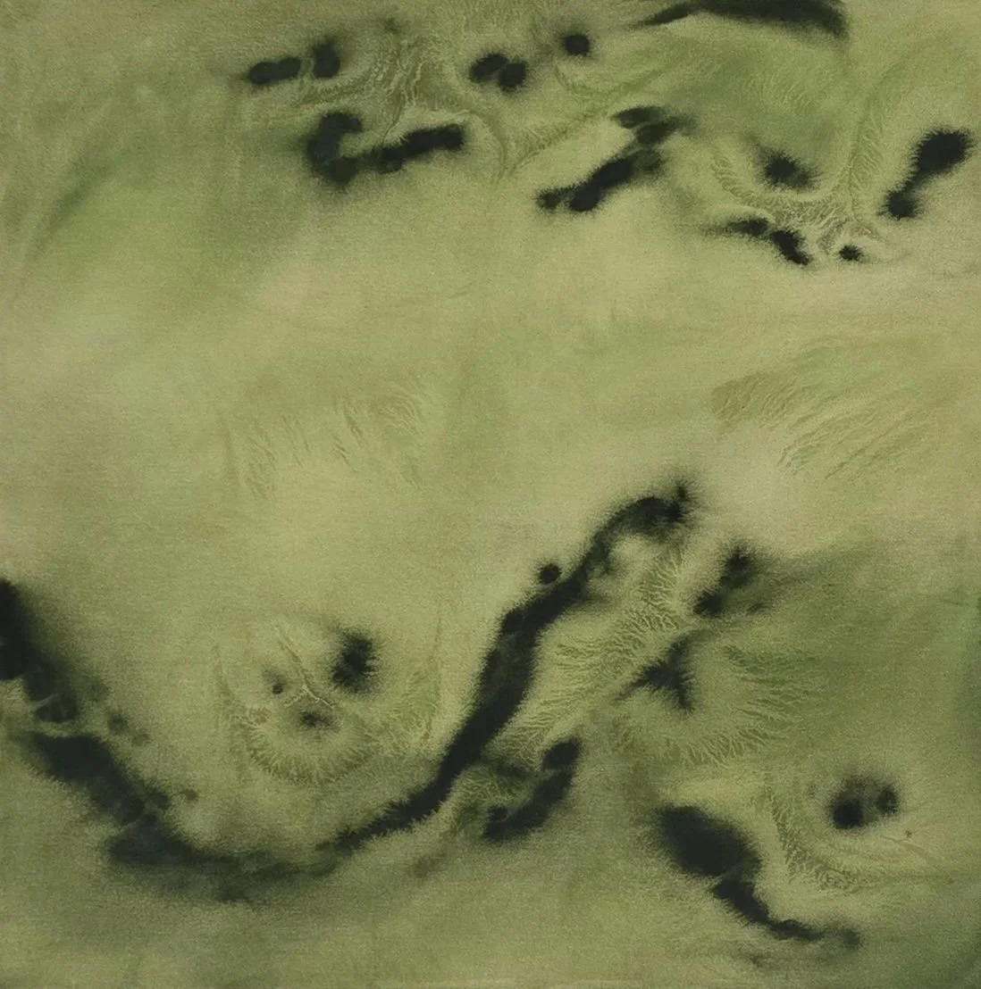
![]()
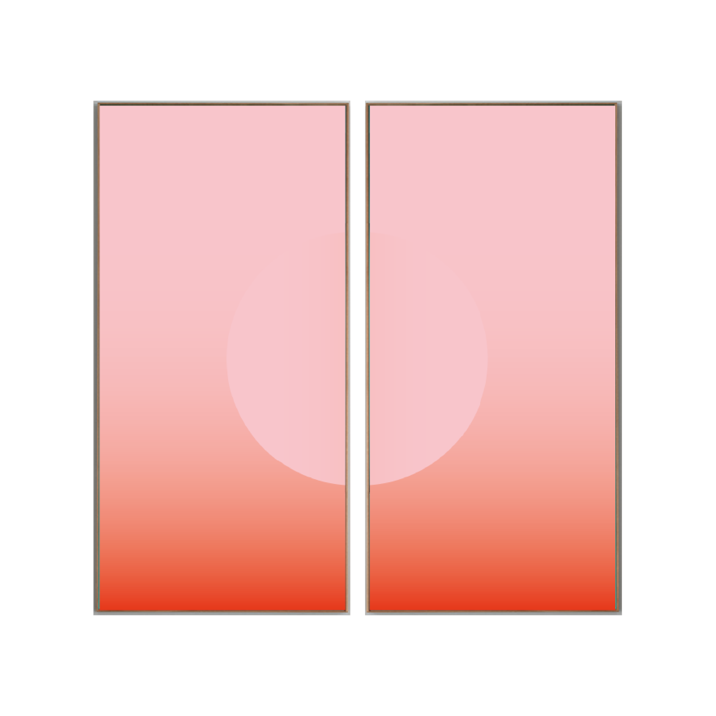
STEPHANIE SAETA, Green Drift, 2026
Acrylic 100 x 100 cm
-
![]()
MARIANA ROMÃO, Shifting, 2025
Photography 25 x 30 cm
-
![]()
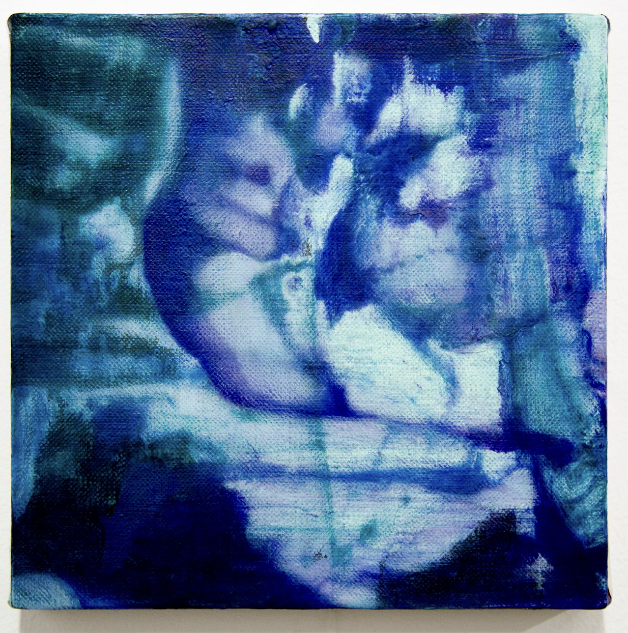
SYDNEY CROSKERY, Freeze, 2026
Oil, Flashe and Acrylic on Linen 20.3 x 20.3 cm
-
![]()
CALLUM HARRISON, Emergence, 2025
Direct exposure on folded analog photo paper with different light sources, unique 40 x 62 cm
WALL 3
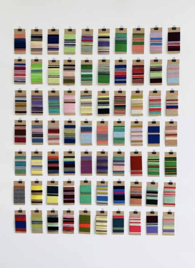
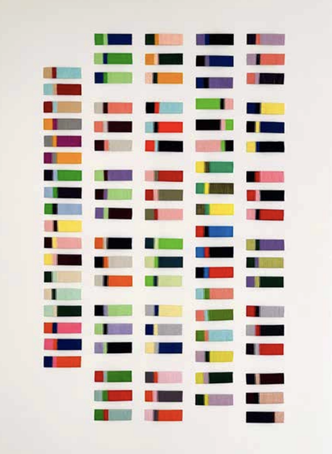
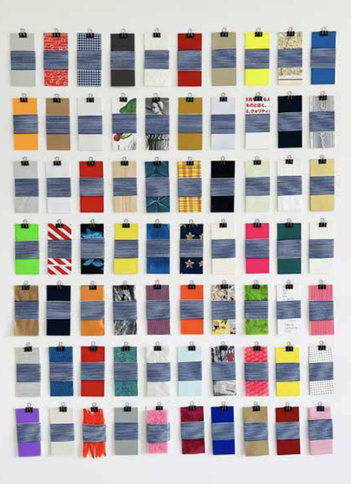
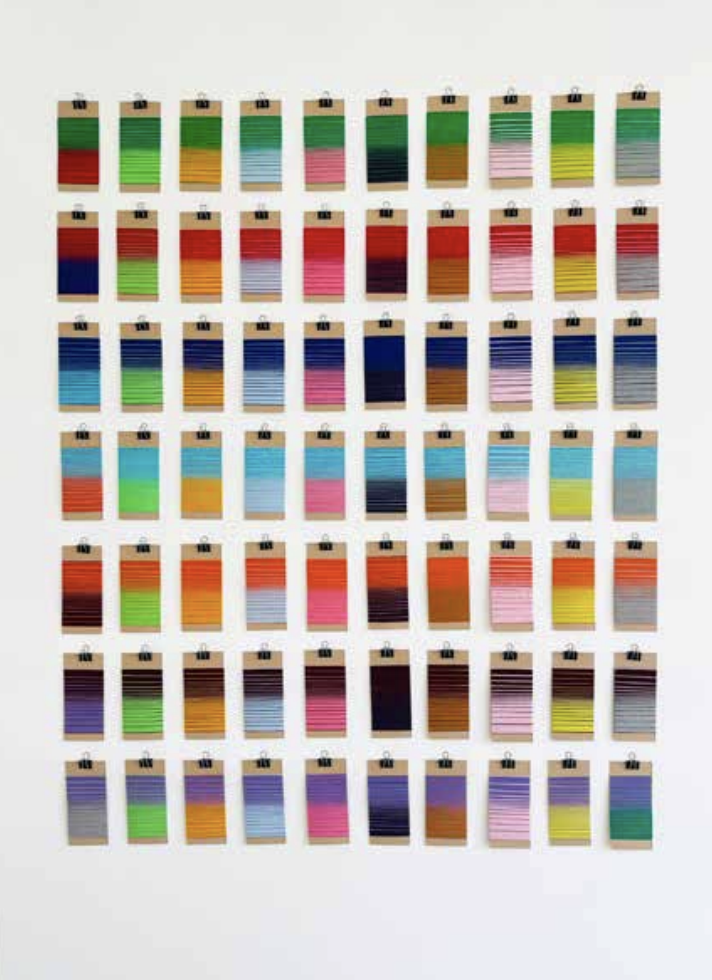
Color As Study
Line Thiesson / Dorota Čechová
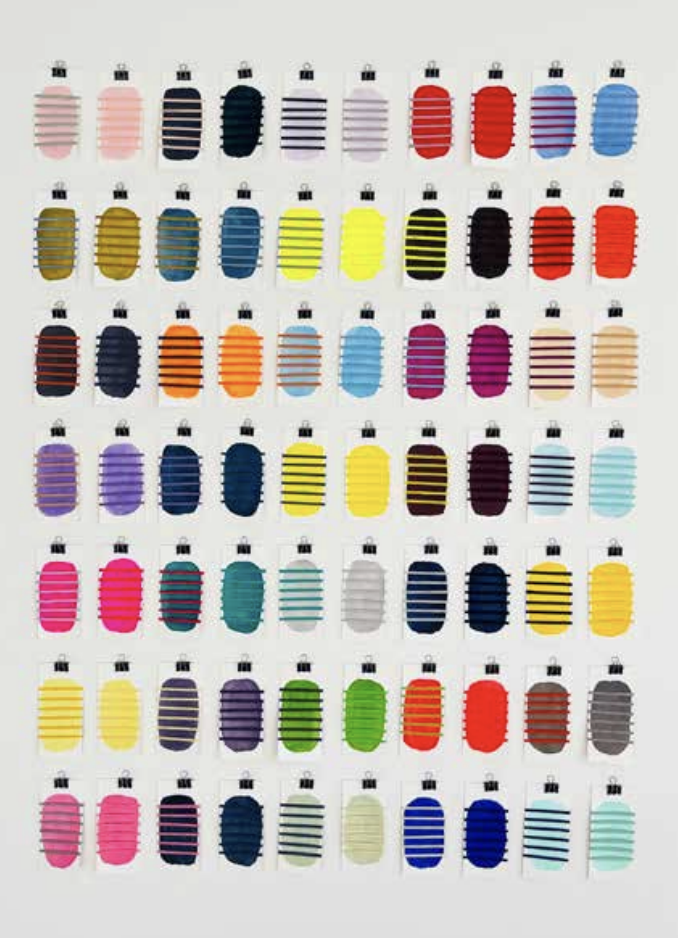
Bringing together research-based works, this selection approaches color as a site of investigation, experimentation and discovery. Presented in book formats accessible via accompanying links, these works shift attention from color as image to color as perception, structure and lived experience.
In Syn(a)isthesis: Harmony of the Senses (2026), Dorota Čechová explores grapheme-colour synesthesia, where letters and numbers are inherently linked to specific hues, framing color as a sensory language that structures perception. In Colour as Relation (2025–2026), Line Thiesson examines color as a relational phenomenon through six interconnected studies of thread-wrapped samples, revealing it as constantly shifting in response to surrounding hues and emphasizing its tactile and perceptual instability.
Together, these works position color as an evolving field of inquiry that extends beyond aesthetics into perception, cognition and sensory experience, inviting viewers to engage through reading, reflection and exploration.
-
![]()
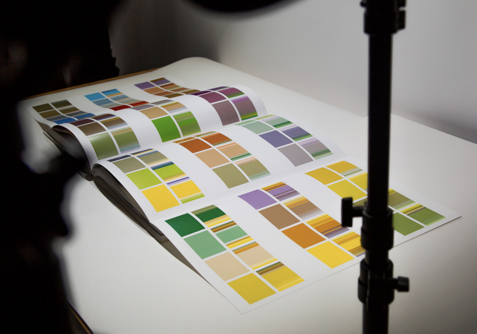
DOROTA ČECHOVÁ Syn(a)isthesis: Harmony of the senses, 2026
Graphic design; Book
-
![]()
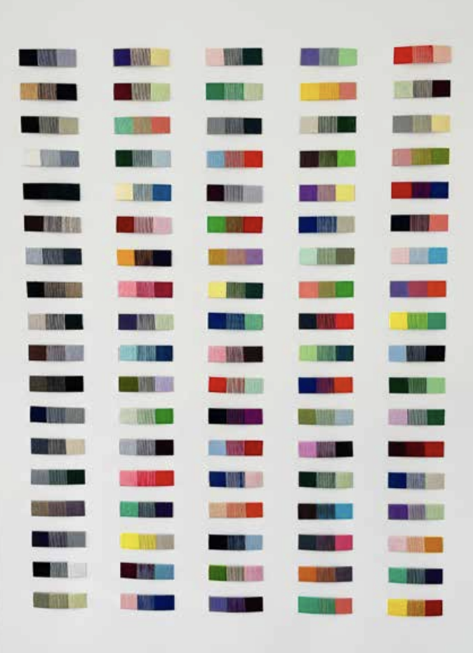
LINE THIESSON, COLOUR IN MOTION (Colour as Relation), 2025-2026
Paper and thread 80 x 120 cm
-
![]()
LINE THIESSON, THE IMPORTANCE OF PROPORTION (Colour as Relation), 2025-2026
Paper and thread 80 x 120 cm
-
![]()
LINE THIESSON, THE INFLUENCE OF SURROUNDINGS (Colour as Relation), 2025-2026
Paper and thread 80 x 120 cm
-
![]()
LINE THIESSON, THE SYSTEMATICS OF COLOUR (Colour as Relation), 2025-2026
Paper and thread 80 x 120 cm
-
![]()
LINE THIESSON, INTERTWINING (Colour as Relation), 2025- 2026
Paper and thread 80 x 120 cm
-
![]()
LINE THIESSON, FORM AND COLOUR (Colour as Relation), 2025-2026
Paper and thread 80 x 120 cm
WALL 4
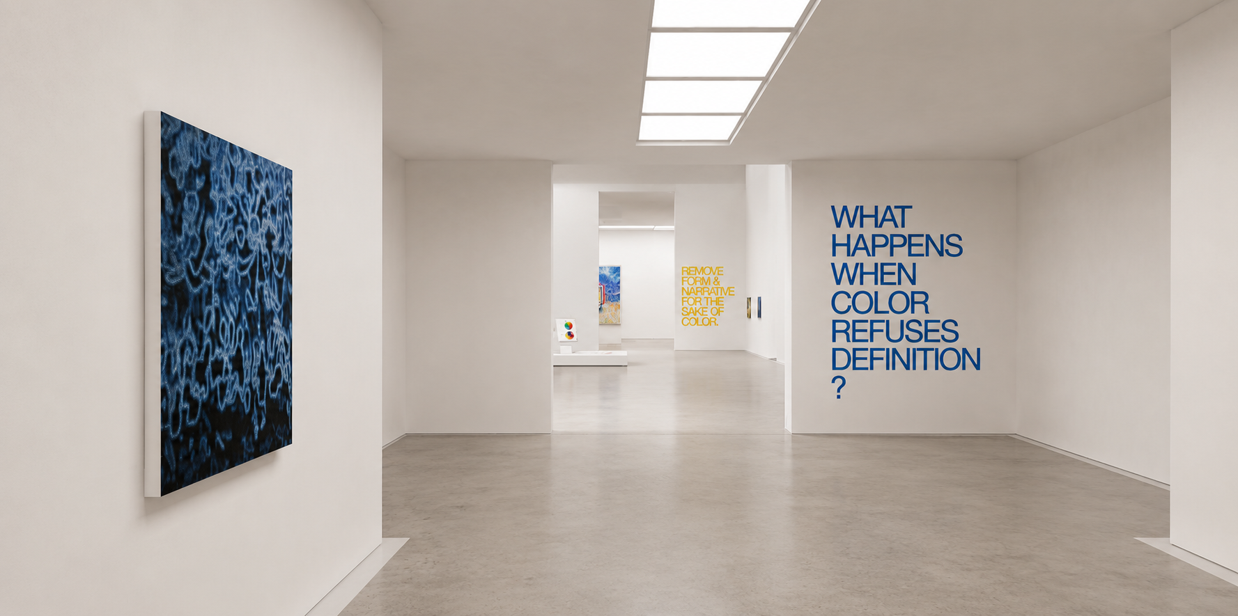
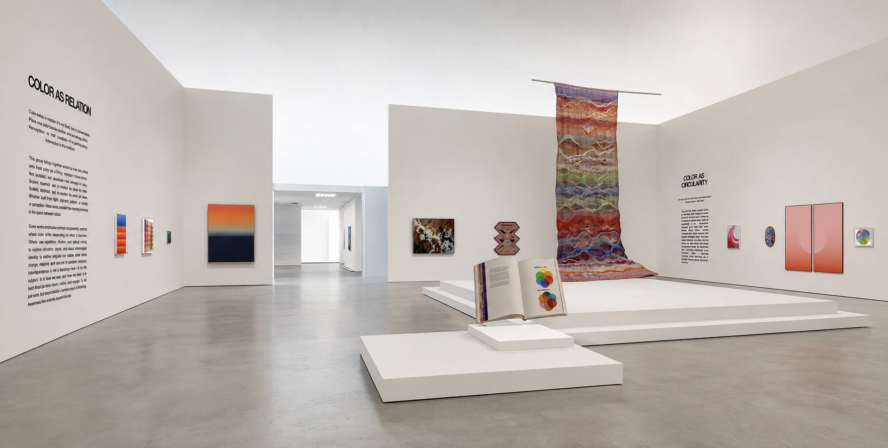
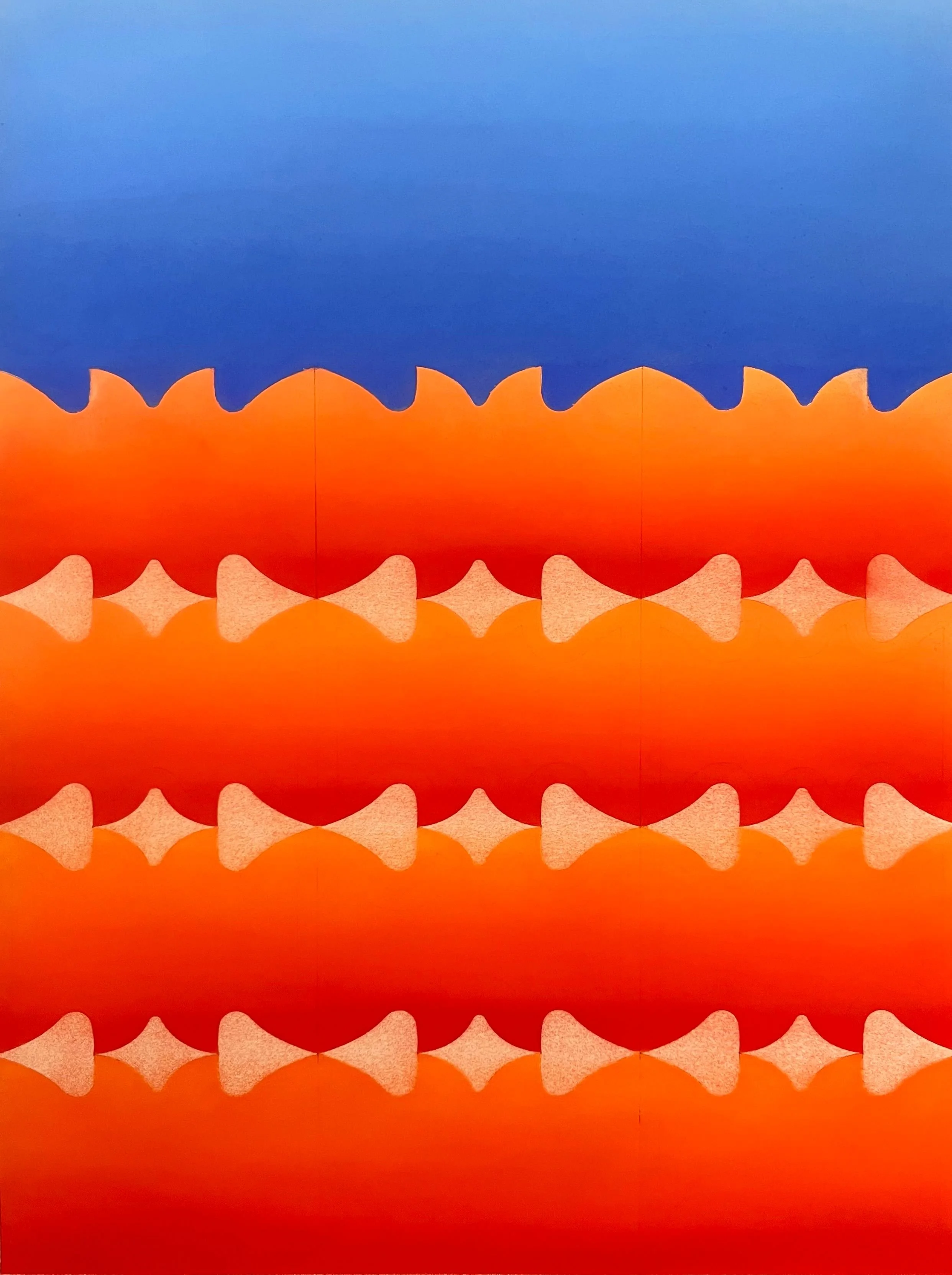
This group brings together works by eleven artists who explore how color behaves in dialogue - with other hues, with material, and with space. Across painting, installation and mixed-media practices, color emerges not as an isolated element, but as something defined through interaction. Whether through tension or harmony, proximity or separation, each work considers how meaning is formed in the space between colors. Some works emphasize contrast and chromatic opposition; others move toward more composed or integrated arrangements, where carefully constructed palettes unfold through balance and resonance. Alongside these, several installation-based works extend these investigations into three-dimensional space, weaving textiles or paper, or shaping and etching colored materials into cohesive environments. In each case, it is the encounter between colors - rather than any single hue - that becomes the central subject of the work.
Color As Relation
Sebastian Ścigalski / Mallika Kanodia / Nicole Pietrantoni / Phlox van Oppen / Sydney Croskery / Natalia Ponomarova / Margherita Marzari / Anna Rolskaya / Samantha Buchanan / Aneeka Khan / Geneva Arystan
-
![]()
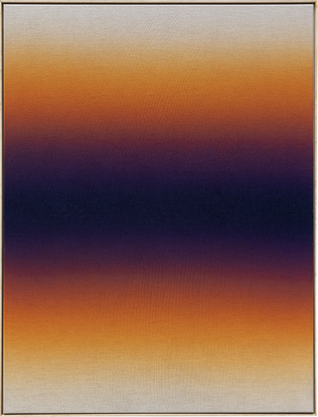
SEBASTIAN ŚCIGALSKI Tonale 001,2025
Acrylic on raw linen canvas 170 x 130 cm
-
![]()
MALLIKA KANODIA POV #3, 2026
Soft pastel on paper 70 x 49.9 cm
-
![]()
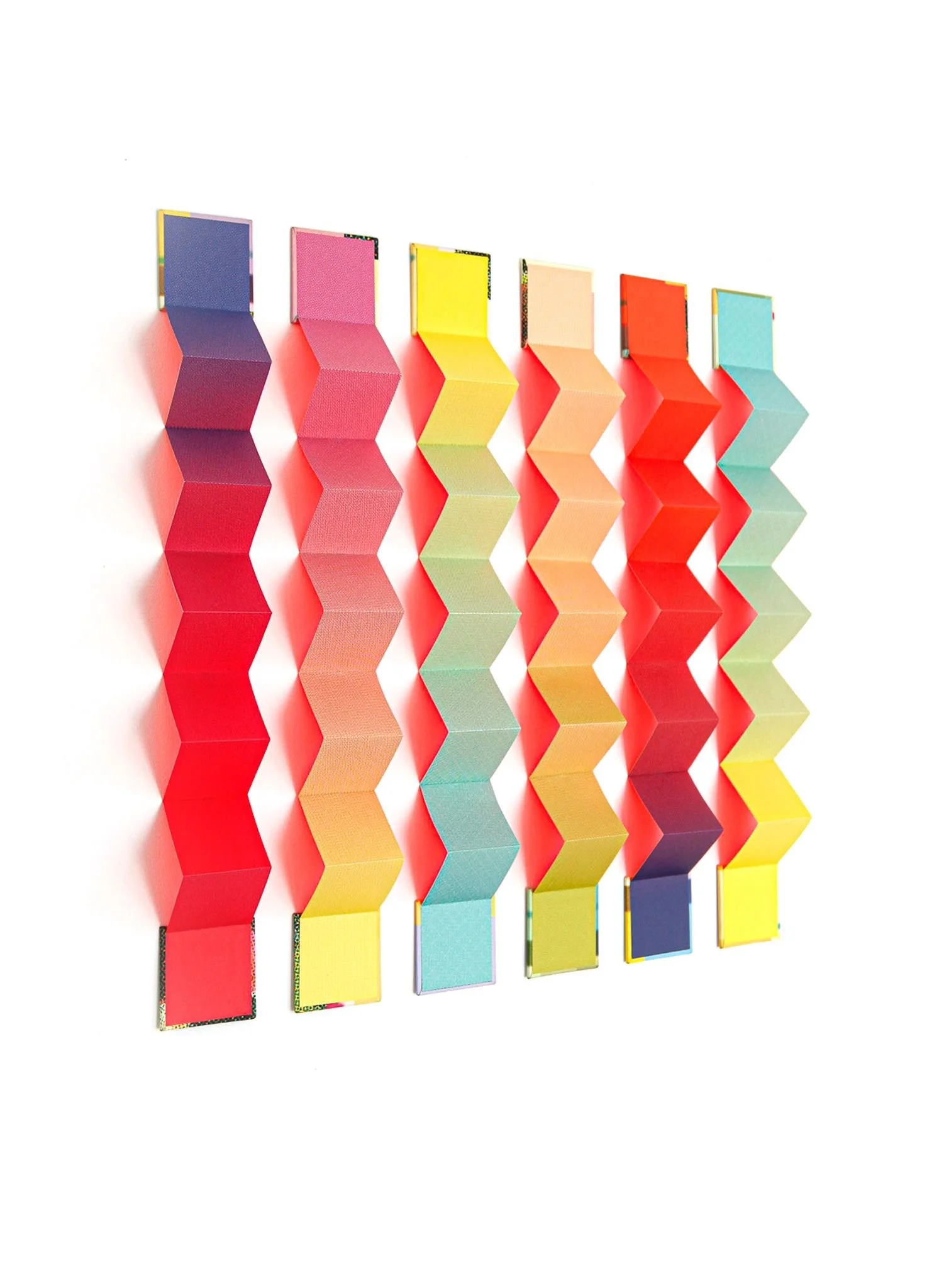
NICOLE PIETRANTONI Color Wave, 2025
Inkjet prints on Japanese paper, handbound into 6 accordion books. 66 x 76.2 x 5 cm
-
![]()
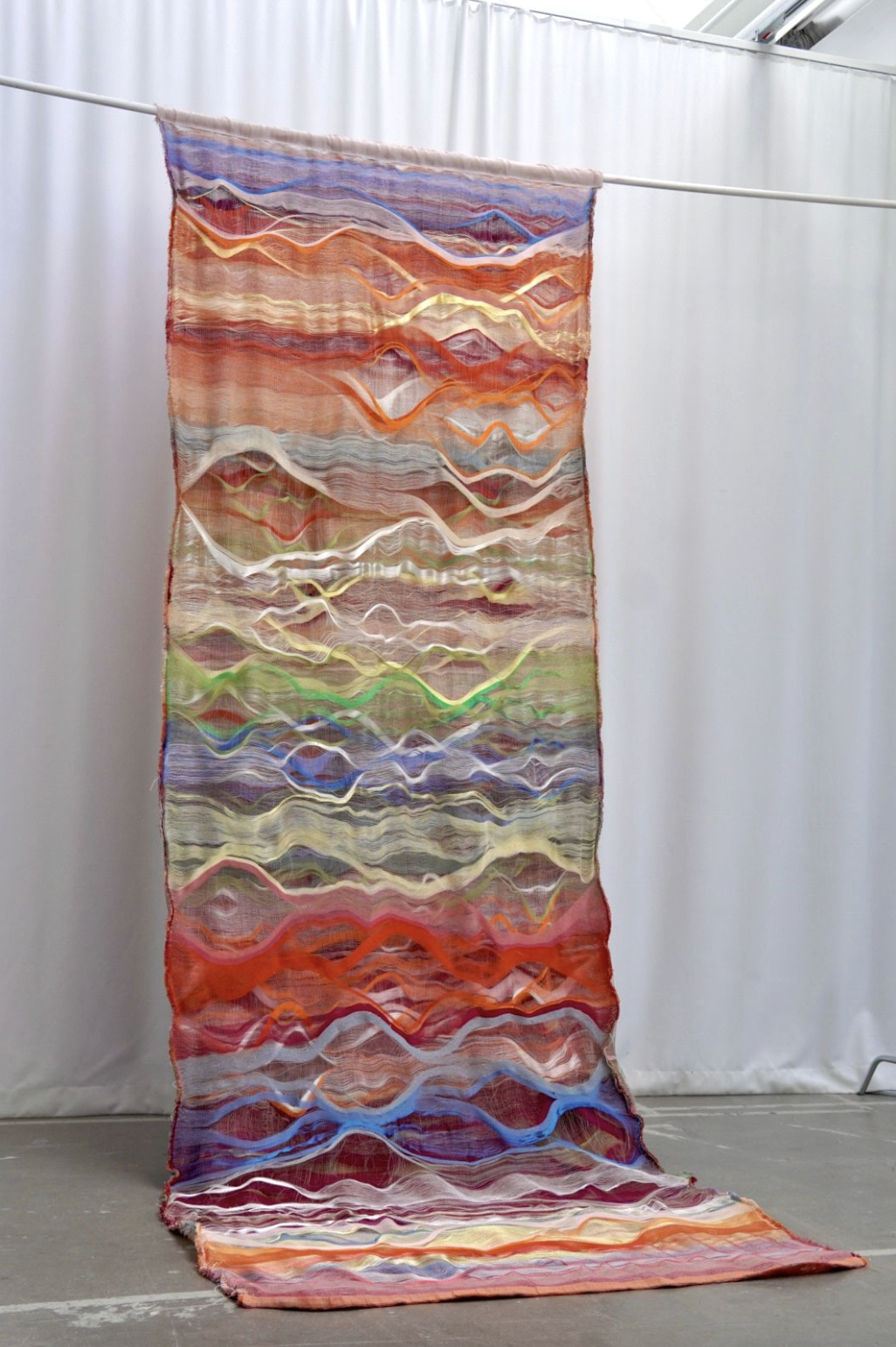
PHLOX VAN OPPEN EMPOWERING , RESILIENCE, HOPE, 2026
Weaving; 150 x 450 cm
-
![]()
SYDNEY CROSKERY Ugly Duckling, 2026
Oil, Flashe and Acrylic on Linen 30.5 x 30.5 cm
-
![]()
NATALIA PONOMAROVA, War Within, 2022
Digital Art, 56 x 86 cm
-
![]()
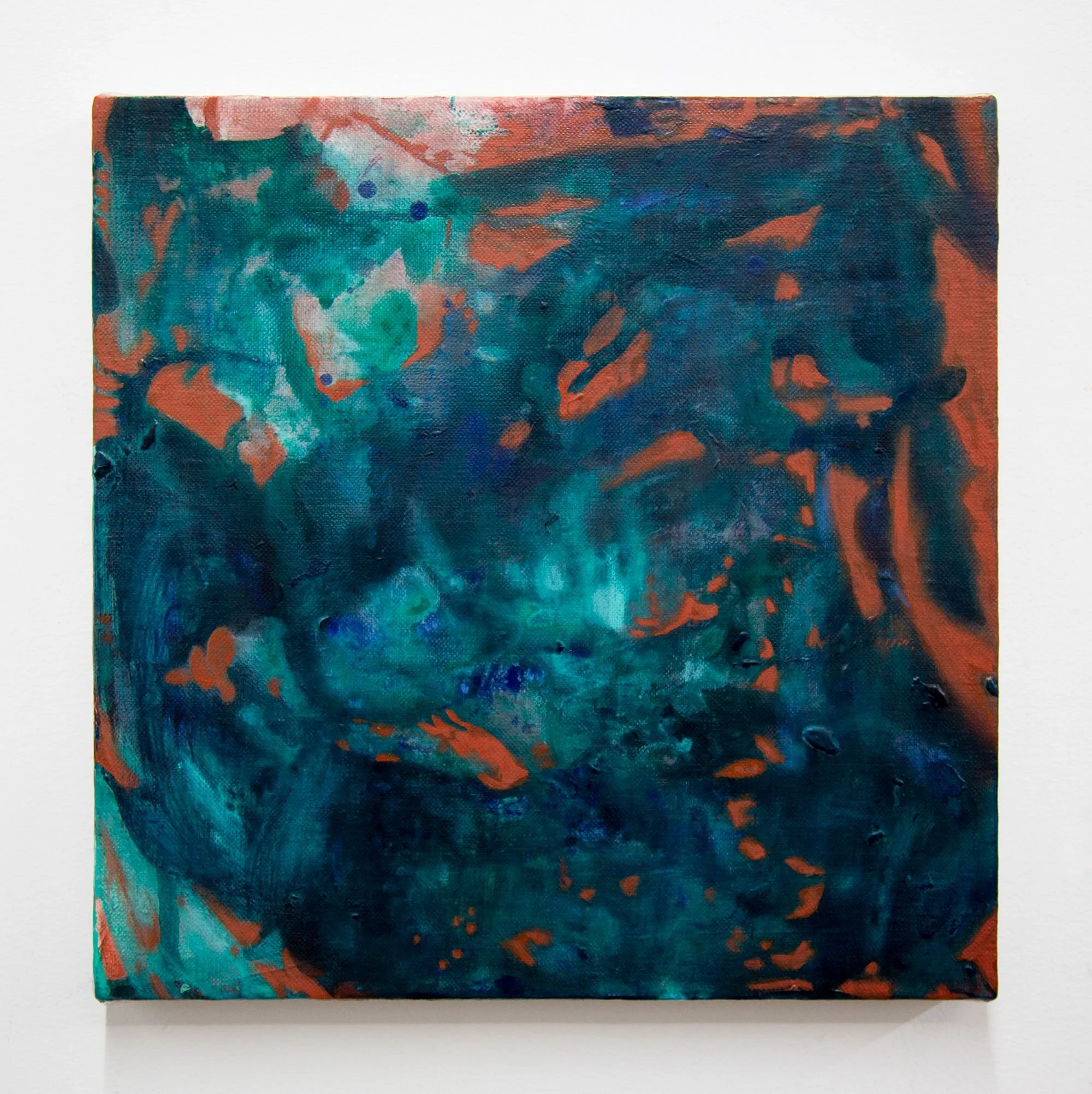
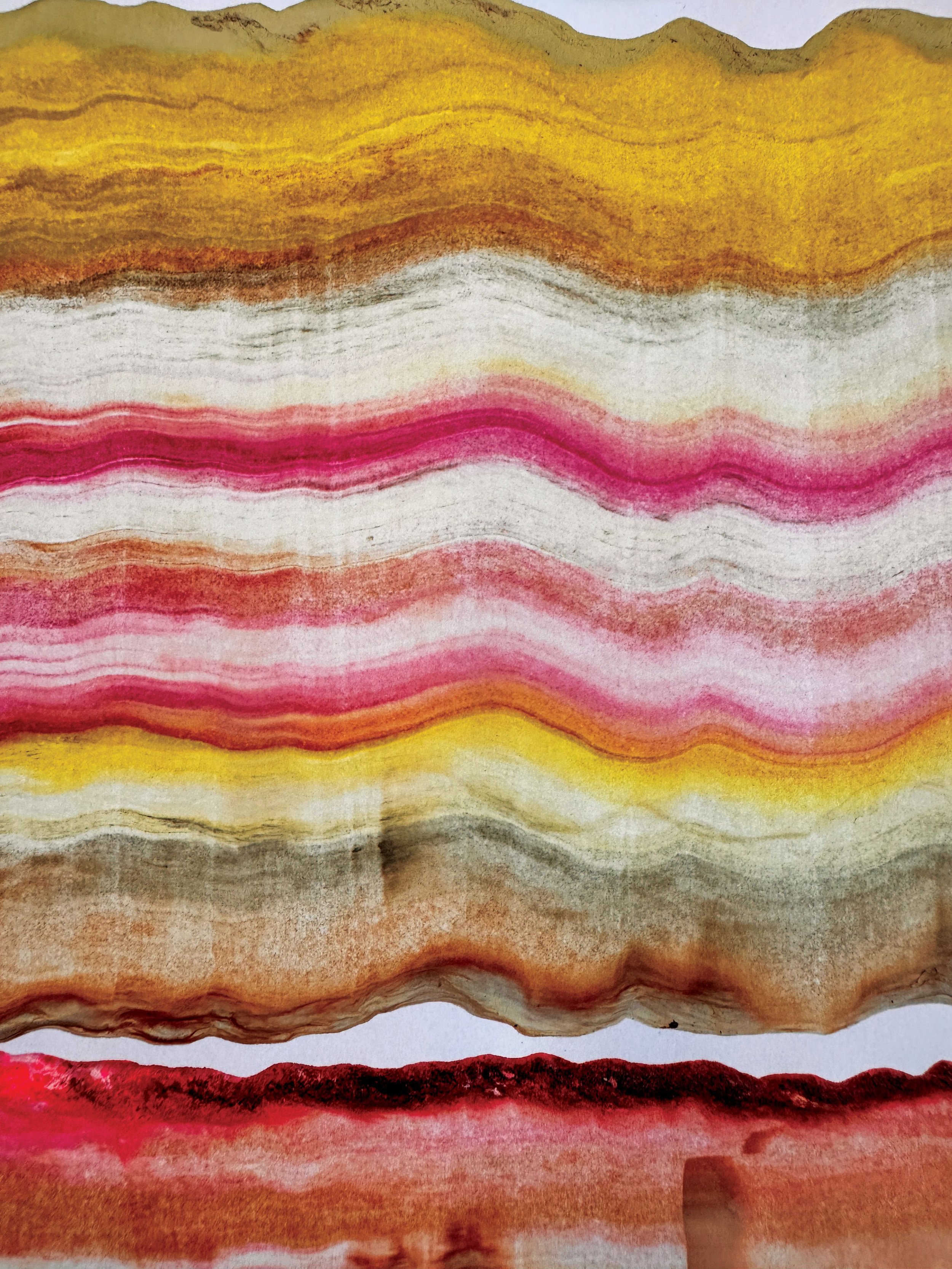
MARGHERITA MARZARI, Rocks, 2026
Acrylic on canvas, 120 x 150 cm
-
![]()
ANNA ROLSKAYA Unfolding, Still, 2026
Acrylic on canvas 100 x 100 cm
-
![]()
SAMANTHA BUCHANAN, Vibrant Matter, 2026
Ink on fiberglass mesh and nylon microfiber with acrylic coated mouldings, 137 x 116 cm
-
![]()
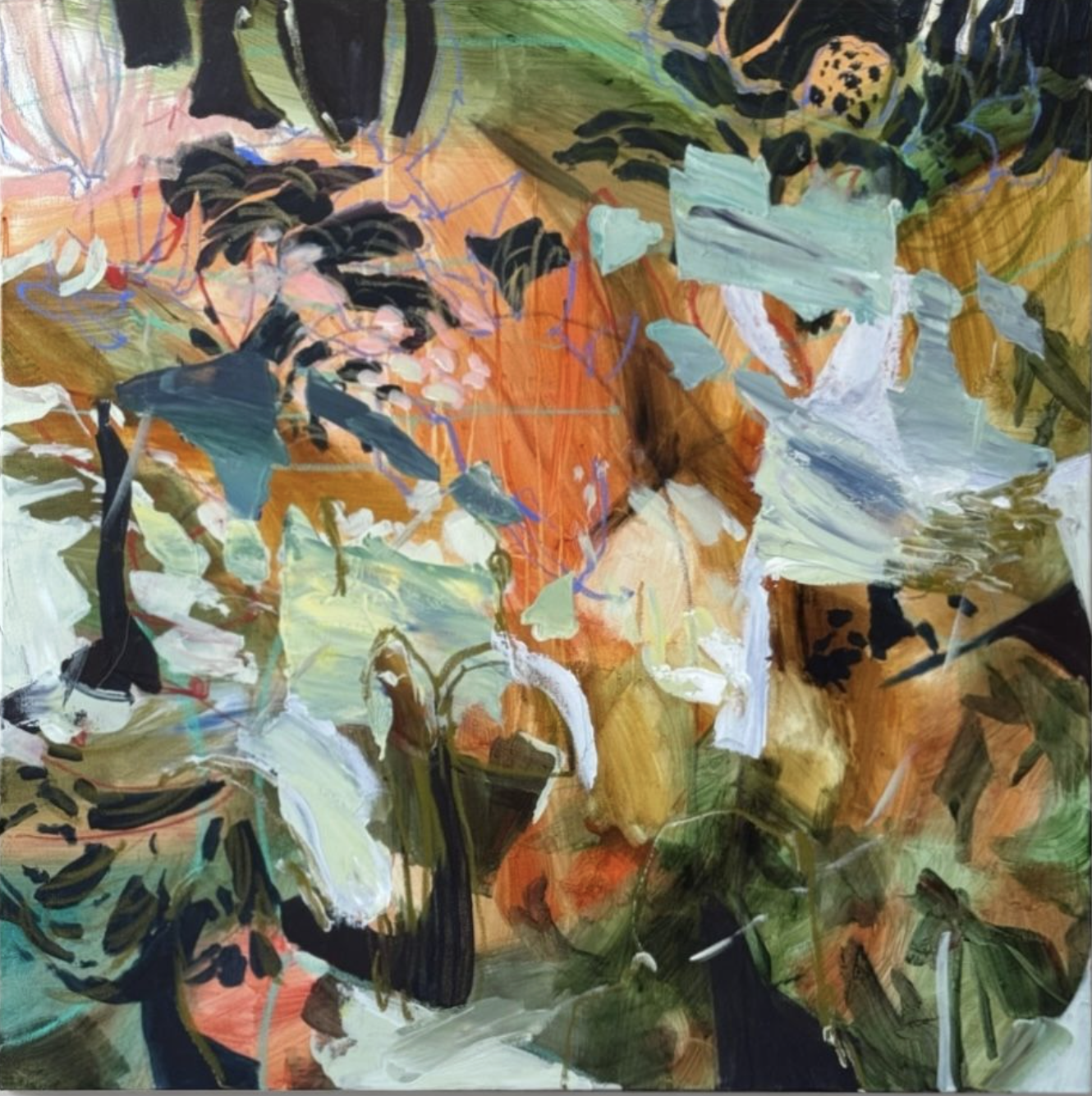
Aneeka Khan, Lost in Translation, 2026
Etching, 48 x 63.5 cm
-
![]()
GENEVA ARYSTAN, Running Through an Open Field, 2026
Clear quartz, moss quartz, rose quartz, prehnite, aquamarine, and acrylic on linen, 100 x 70 cm
WALL 5
Color As Circularity
Tora Kizu / Maciej Józef Klich / Gil Zablodovsky / Michelle Haidet / Salla Aida
This grouping brings together works by five artists who engage the circle as both form and concept, using it as a structure through which color is experienced as continuous, returning, and never fully fixed. Across these works, circular compositions, looping gestures, and rotational systems shape how color unfolds, allowing chromatic shifts to move in cycles rather than linear progressions. Within this framework, color becomes inseparable from movement itself - returning, repeating, and transforming as it circulates through space, perception, and time.
-
![]()
TORA KIZU, Peony ~The Flowers~, 2026
Digital Art, 51.5 x 72.8 cm
-
![]()
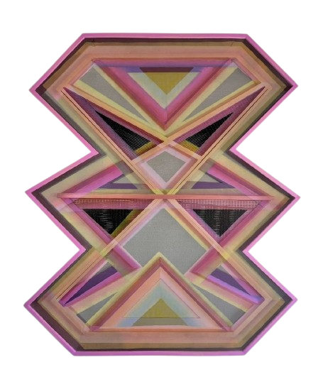
MACIEJ JÓZEF KLICH, Plenus Reflection, 2025
Cyanotype, acrylic, mirror, wood, 40 x 69 cm
-
![]()
GIL ZABLODOVSKY, SUNSET, 2025
Digital Archival Pigment Print (Giclée), 250 x 250 cm
-
![]()
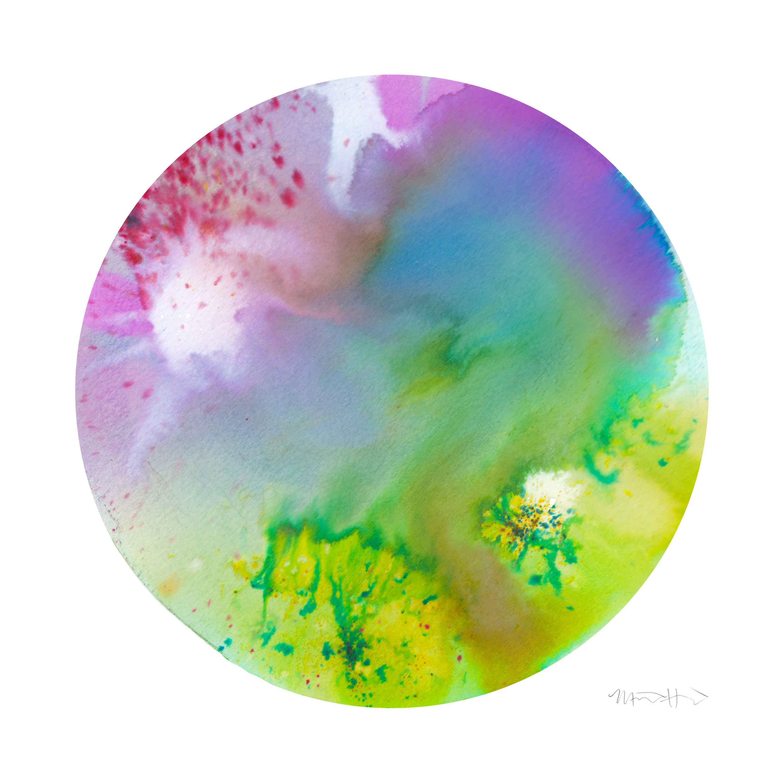
MICHELLE HAIDET, Fruit Riot, 2026
Watercolor and mixed media, digitally refined fine art print, 45 × 45 cm
-
![]()
SALLA AIDA, Untitled, 2025
Archival pigment print on Fine Art paper, 90 x 60 cm
WALL 6
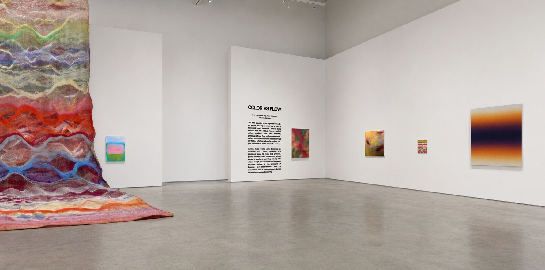
Color As Flow
Delia Hou / Grace Fung / Bron Alexander / Sebastian Ścigalski
This final grouping brings together works by six artists who explore color as a state of movement and transition, where hues dissolve into one another through gradual shifts, gradients, and fluid chromatic passages. Rather than existing in separation, colors here are experienced as continuously unfolding, with boundaries that soften, blur, and re-form as they move across the surface.
Across these works, color becomes an embodied flow - rising, dispersing, and merging in ways that resist fixed definition. Subtle transitions and atmospheric blends create a sense of continuity, guiding the viewer through spaces where one hue gently becomes another. In this openness of passage and transformation, color is encountered not as a static element, but as an ongoing process of becoming.
-
![]()
DELIA HOU, Derrumbe, 2026
Oil on linen, 142 x 96.5 cm
-
![]()
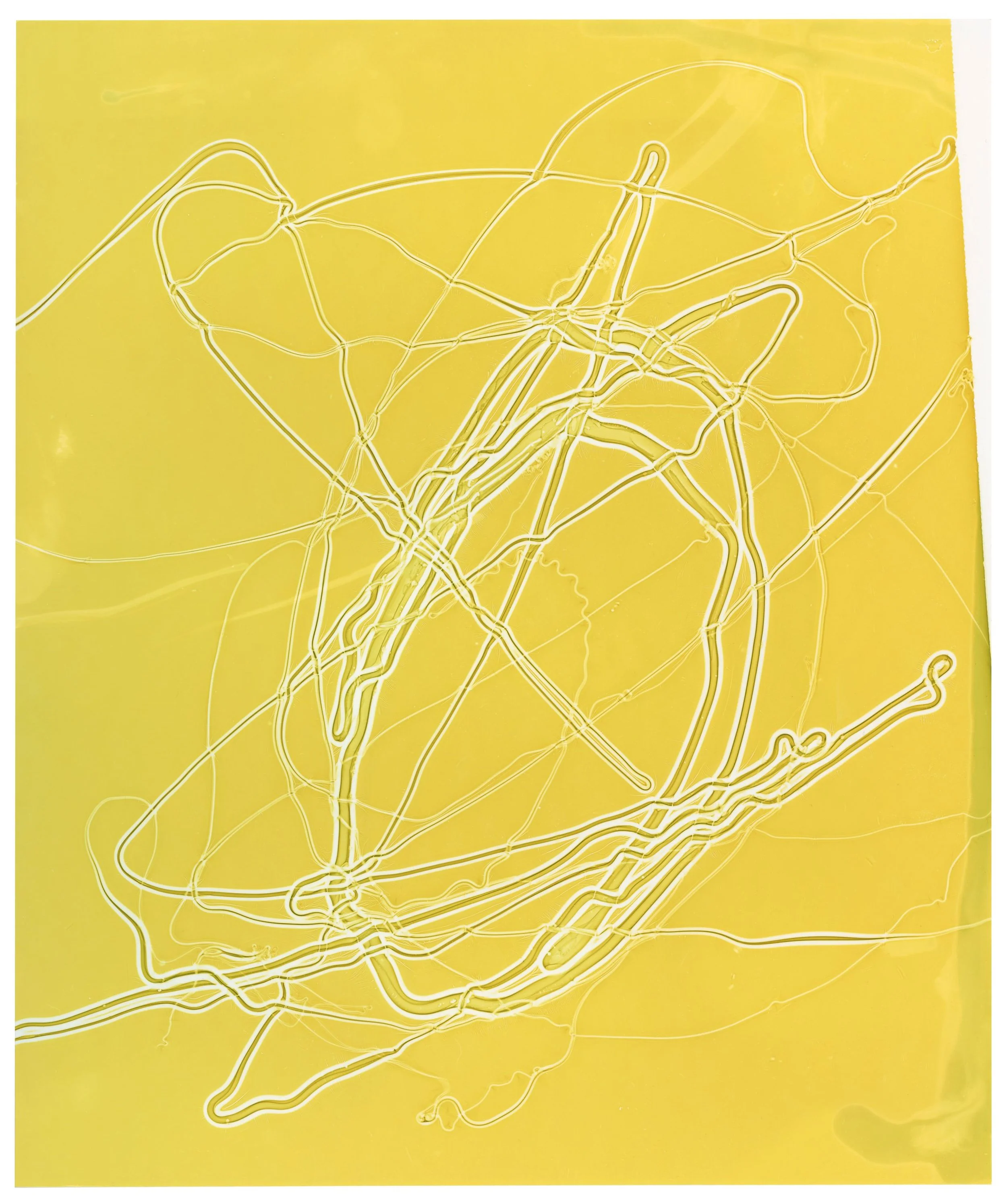
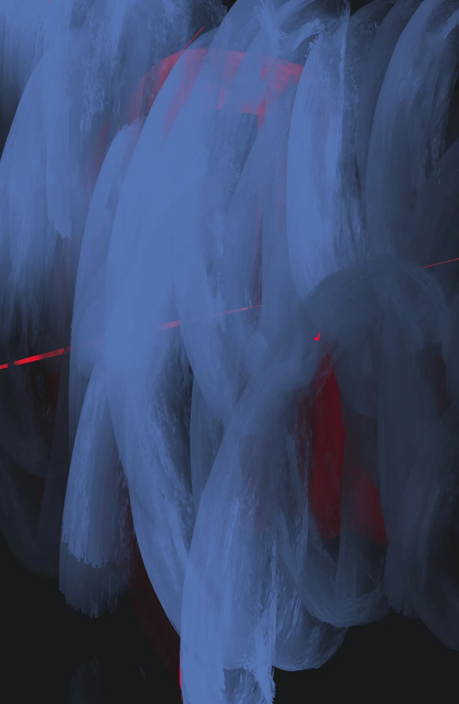
BRON ALEXANDER, Mortal Coil, 2026
Acrylic paint & ink on calligraphy paper, 34 x 45 cm
-
![]()
SEBASTIAN ŚCIGALSKI, Tonale 005, 2026
Acrylic on raw linen canvas, 170 x 130 cm
-
![]()
GRACE FUNG, Shape of a Memory, 2026
Acrylic, oil, oil pastel, 100 x 100 cm

Explore a 360° Virtual Gallery
Enter the exhibition and use your mouse or arrows to navigate. Click artworks for details.